Final review
Questions
Suggested answers posted! But I would resist the temptation to look at them before going through the questions yourself.
Part 1 - Employment
Suppose a large university wants to know how working > 5 hours a week relates to students’ academic performance.
They randomly sample 50 students; the determine both their working status (more or less than 5 hours a week) and their GPA. They want to test if the GPAs of students working more than 5 hours a week are, on average, the same as the GPAs of students working less than 5 hours a week.
Throughout this part, we will refer to work as the variable equal to Less or More than 5 hours (where Less is the baseline) and gpa as the GPA variable. The data frame is named students.
Question 1
First, suppose we want to do some EDA to examine the distributions of GPAs across the working status categories.
Which of the following types of plots would be most appropriate for doing so? Select all that apply.
Boxplots
Bar chart
Histograms
Pie chart
Density plots
Question 2
Now, suppose we wanted to look at the mean GPA in each category. Which of the following pieces of code could we have run to get the table below?
# A tibble: 2 × 2
  work   mean
  <chr> <dbl>
1 Less   3.58
2 More 3.66Question 3
Now, we want to fit a regression to predict gpa using work. Which of the following pieces of code are valid ways to get estimated regression parameters?
linear_reg() |>
fit(gpa ~ work, data = students)logistic_reg() |>
fit(gpa ~ work, data = students)logistic_reg() |>
fit(work ~ students, data = students)students |>
specify(gpa ~ work) |>
fit()students |>
specify(work ~ gpa) |>
fit()Question 4
How will we write the output of our estimated regression line?
- \(\widehat{gpa} = b_0 + b_1\times work\)
- \(\widehat{gpa} = b_0 + b_1\times Less\)
- \(\widehat{gpa} = b_0 + b_1\times More\)
- \(\widehat{gpa} = b_0 + b_1\times More + b_2 \times Less\)
- \(\widehat{work} = b_0 + b_1\times gpa\)
Question 5
Using everything we have seen about the data so far (hint: refer back to question 2), what will the estimated values of \(b_1\) and \(b_0\) be?
You should only need information from questions prior to this one. Information in Question 7 may help you, but you should NOT rely on this information; there is no guarantee you would have it on the exam. I would recommend picking an answer to this question before going any further.
- \(b_0 = 3.576\), \(b_1 = 3.658\)
- \(b_0 = 3.658\), \(b_1 = 3.576\)
- \(b_0 = 3.576\), \(b_1 = 0.0814\)
- \(b_0 = 3.658\), \(b_1 = -0.0814\)
- \(b_0 = 3.658\), \(b_1 = 0.0814\)
Question 6
Now it’s time to perform a hypothesis test to see if the GPAs of the two groups are equal on average. Which of the following is the correct set of hypotheses to test?
- \(H_0: \beta_0 = 0\), \(H_A: \beta_0 \neq 0\)
- \(H_0: \beta_0 \neq 0\), \(H_A: \beta_0 = 0\)
- \(H_0: \beta_1 = 0\), \(H_A: \beta_1 \neq 0\)
- \(H_0: \beta_1 \neq 0\), \(H_A: \beta_1 = 0\)
- \(H_0: \beta_0 = \beta_1\), \(H_A: \beta_0 \neq \beta_1\)
Question 7
The simulated null distribution and point estimate are displayed below.
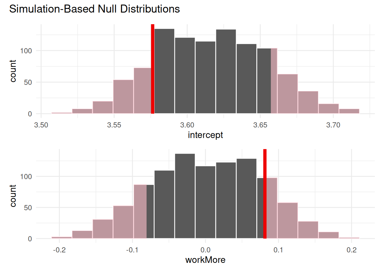
# A tibble: 2 × 2
  term      p_value
  <chr>       <dbl>
1 intercept   0.304
2 workMore    0.304
Which of the following statements are true? Select all that apply.
- At the 5% discernability level, we reject the null hypothesis.
- At the 5% discernability level, we fail to reject the null hypothesis.
- About 30% of the samples in the null distribution were more extreme than our observed value.
- About 30% of the samples in the null distribution were less extreme than our observed value.
- About 15% of the samples in the null distribution were greater than our observed value.
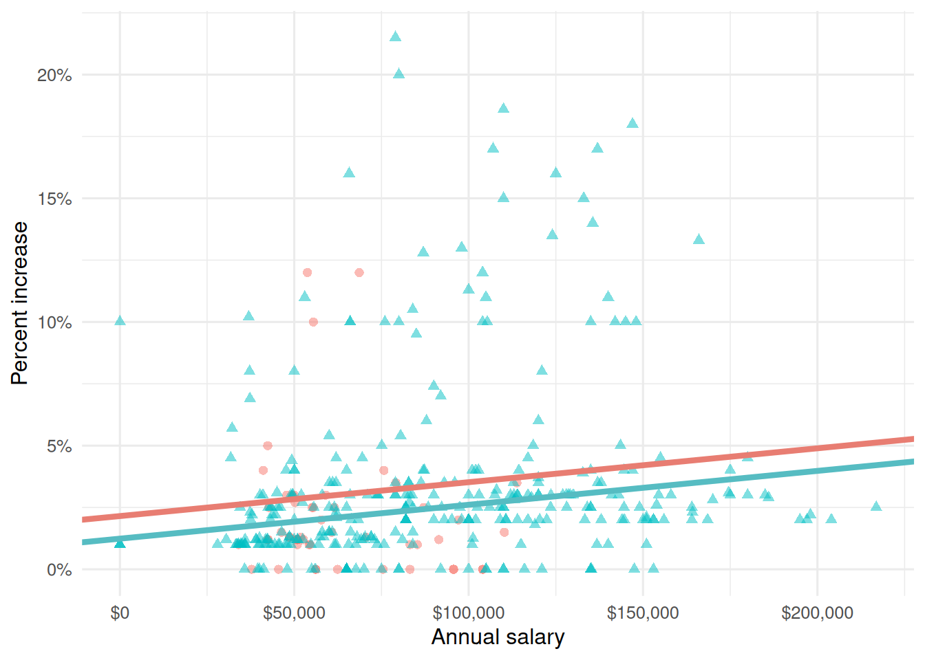
Part 2 - Blizzard
In 2020, employees of Blizzard Entertainment circulated a spreadsheet to anonymously share salaries and recent pay increases amidst rising tension in the video game industry over wage disparities and executive compensation. (Source: Blizzard Workers Share Salaries in Revolt Over Pay)
The name of the data frame used for this analysis is blizzard_salary and the variables are:
percent_incr: Raise given in July 2020, as percent increase with values ranging from 1 (1% increase to 21.5 (21.5% increase)salary_type: Type of salary, with levelsHourlyandSalariedannual_salary: Annual salary, in USD, with values ranging from $50,939 to $216,856.performance_rating: Most recent review performance rating, with levelsPoor,Successful,High, andTop. ThePoorlevel is the lowest rating and theToplevel is the highest rating.
The top ten rows of blizzard_salary are shown below:
# A tibble: 409 × 4
   percent_incr salary_type annual_salary performance_rating
          <dbl> <chr>               <dbl> <chr>
 1          1   Salaried               1  High
 2          1   Salaried               1  Successful
 3          1   Salaried               1  High
 4          1   Hourly             33987. Successful
 5         NA   Hourly             34798. High
 6         NA   Hourly             35360  <NA>
 7         NA   Hourly             37440  <NA>
 8          0   Hourly             37814. <NA>
 9          4   Hourly             41101. Top
10          1.2 Hourly             42328  <NA>
# ℹ 399 more rows
Question 8
Next, you fit a model for predicting raises (percent_incr) from salaries (annual_salary). We’ll call this model raise_1_fit. A tidy output of the model is shown below.
# A tibble: 2 × 5
  term           estimate  std.error statistic   p.value
  <chr>             <dbl>      <dbl>     <dbl>     <dbl>
1 (Intercept)   1.87      0.432           4.33 0.0000194
2 annual_salary 0.0000155 0.00000452      3.43 0.000669
Which of the following is the best interpretation of the slope coefficient?
- For every additional $1,000 of annual salary, the model predicts the raise to be higher, on average, by 1.55%.
- For every additional $1,000 of annual salary, the raise goes up by 0.0155%.
- For every additional $1,000 of annual salary, the model predicts the raise to be higher, on average, by 0.0155%.
- For every additional $1,000 of annual salary, the model predicts the raise to be higher, on average, by 1.87%.
Question 9
You then fit a model for predicting raises (percent_incr) from salaries (annual_salary) and performance ratings (performance_rating). We’ll call this model raise_2_fit. Which of the following is definitely true based on the information you have so far?
- Intercept of
raise_2_fitis higher than intercept ofraise_1_fit. - Slope of
raise_2_fitis higher than RMSE ofraise_1_fit. - Adjusted \(R^2\) of
raise_2_fitis higher than adjusted \(R^2\) ofraise_1_fit. -
\(R^2\) of
raise_2_fitis higher \(R^2\) ofraise_1_fit.
Question 10
The tidy model output for the raise_2_fit model you fit is shown below.
# A tibble: 5 × 5
  term                            estimate  std.error statistic  p.value
  <chr>                              <dbl>      <dbl>     <dbl>    <dbl>
1 (Intercept)                   3.55       0.508           6.99 1.99e-11
2 annual_salary                 0.00000989 0.00000436      2.27 2.42e- 2
3 performance_ratingPoor       -4.06       1.42           -2.86 4.58e- 3
4 performance_ratingSuccessful -2.40       0.397          -6.05 4.68e- 9
5 performance_ratingTop         2.99       0.715           4.18 3.92e- 5
When your teammate sees this model output, they remark “The coefficient for performance_ratingSuccessful is negative, that’s weird. I guess it means that people who get successful performance ratings get lower raises.” How would you respond to your teammate?
Question 11
Ultimately, your teammate decides they don’t like the negative slope coefficients in the model output you created (not that there’s anything wrong with negative slope coefficients!), does something else, and comes up with the following model output.
# A tibble: 5 × 5
  term                            estimate  std.error statistic    p.value
  <chr>                              <dbl>      <dbl>     <dbl>      <dbl>
1 (Intercept)                  -0.511      1.47          -0.347 0.729
2 annual_salary                 0.00000989 0.00000436     2.27  0.0242
3 performance_ratingSuccessful  1.66       1.42           1.17  0.242
4 performance_ratingHigh        4.06       1.42           2.86  0.00458
5 performance_ratingTop         7.05       1.53           4.60  0.00000644
Unfortunately they didn’t write their code in a Quarto document, instead just wrote some code in the Console and then lost track of their work. They remember using the fct_relevel() function and doing something like the following:
blizzard_salary <- blizzard_salary |>
  mutate(performance_rating = fct_relevel(performance_rating, ___))
What should they put in the blanks to get the same model output as above?
- “Poor”, “Successful”, “High”, “Top”
- “Successful”, “High”, “Top”
- “Top”, “High”, “Successful”, “Poor”
- Poor, Successful, High, Top
Question 12
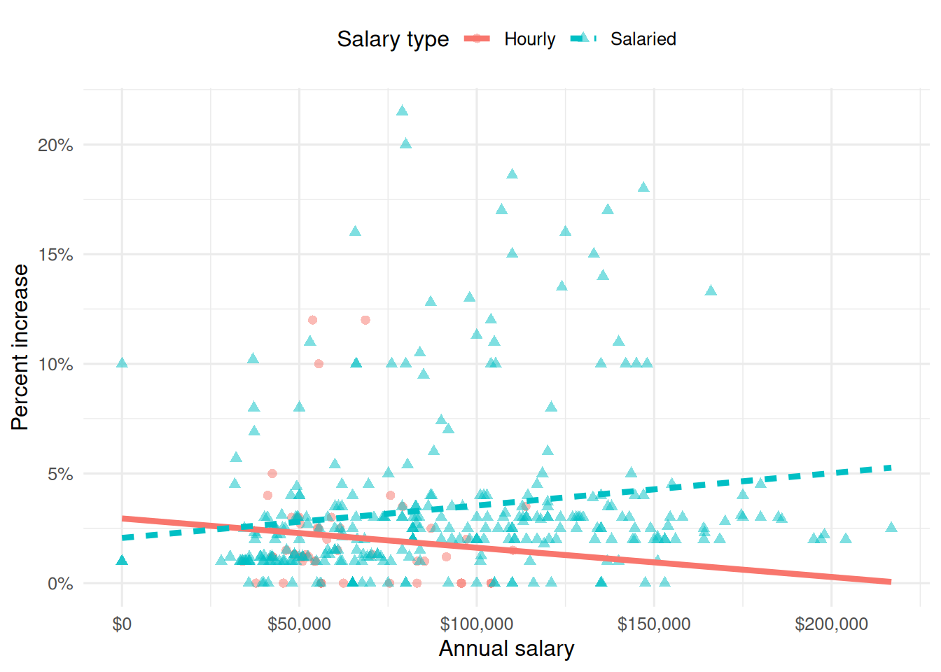
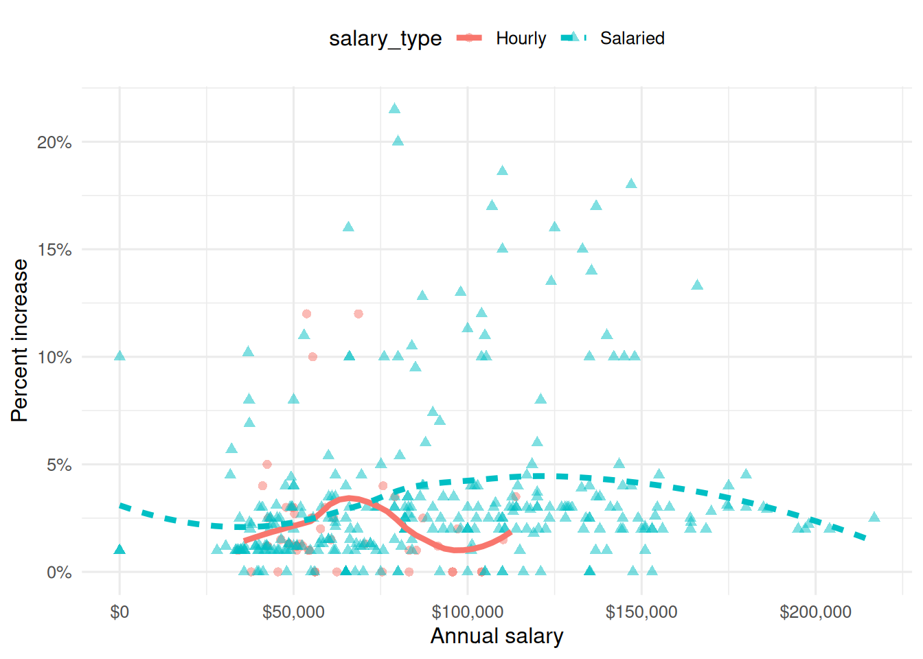
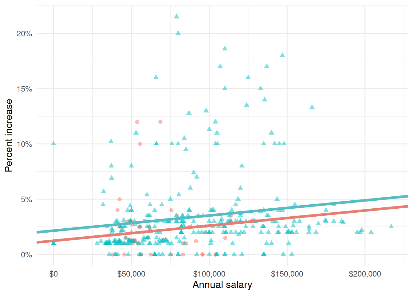
Suppose we fit a model to predict percent_incr from annual_salary and salary_type. A tidy output of the model is shown below.
# A tibble: 3 × 5
  term                 estimate  std.error statistic p.value
  <chr>                   <dbl>      <dbl>     <dbl>   <dbl>
1 (Intercept)         1.24      0.570           2.18 0.0300
2 annual_salary       0.0000137 0.00000464      2.96 0.00329
3 salary_typeSalaried 0.913     0.544           1.68 0.0938
Which of the following visualizations represent this model? Explain your reasoning.
Part 3 - Miscellaneous
Question 13
Which of the following is the is the population model in linear regresion? a. \(\hat{y} = \beta_0 + \beta_1 X_1\)
b. \(y = \beta_0 + \beta_1 X_1\)
c. \(\hat{y} = \beta_0 + \beta_1 X_1 + \epsilon\)
d. \(y = \beta_0 + \beta_1 X_1 + \epsilon\)
Question 14
Choose the best answer.
A survey based on a random sample of 2,045 American teenagers found that a 95% confidence interval for the mean number of texts sent per month was (1450, 1550). A valid interpretation of this interval is
- 95% of all teens who text send between 1450 and 1550 text messages per month.
- If a new survey with the same sample size were to be taken, there is a 95% chance that the mean number of texts in the sample would be between 1450 and 1550.
- We are 95% confident that the mean number of texts per month of all American teens is between 1450 and 1550.
Question 15
I have a dataset with weather data. Each day, I have variable precip that is 1 if it has rained and 0 if it has not rained. I want to use all of the variables in my data set to predict whether it has rained or not. What type of model should I use?
- Logistic regression
- Simple linear regression
- Additive linear regression
- R^2 regression
- AUC regression
Question 16
Which is a 98% confidence interval?
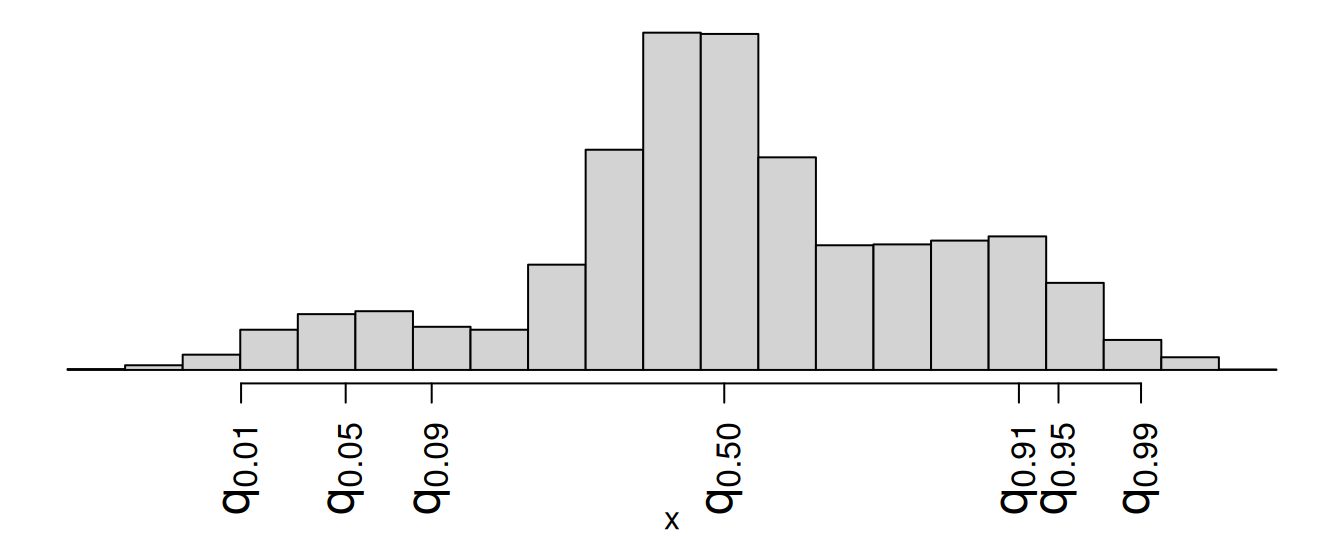
- \((q_{0.01},\,q_{0.91})\)
- \((q_{0.01},\,q_{0.99})\)
- \((q_{0.09},\,q_{0.95})\)
- \((q_{0.05},\,q_{0.99})\)
Question 17
True or false: In hypotheses testing, rejecting the null when the null is true is referred to as a Type II error.
Question 18
True or false: In simple linear regression, the slope will always have the same sign as the correlation coefficient.
Question 19
What is your best guess for the value of \(R^2\) for the line of best fit shown in this image?
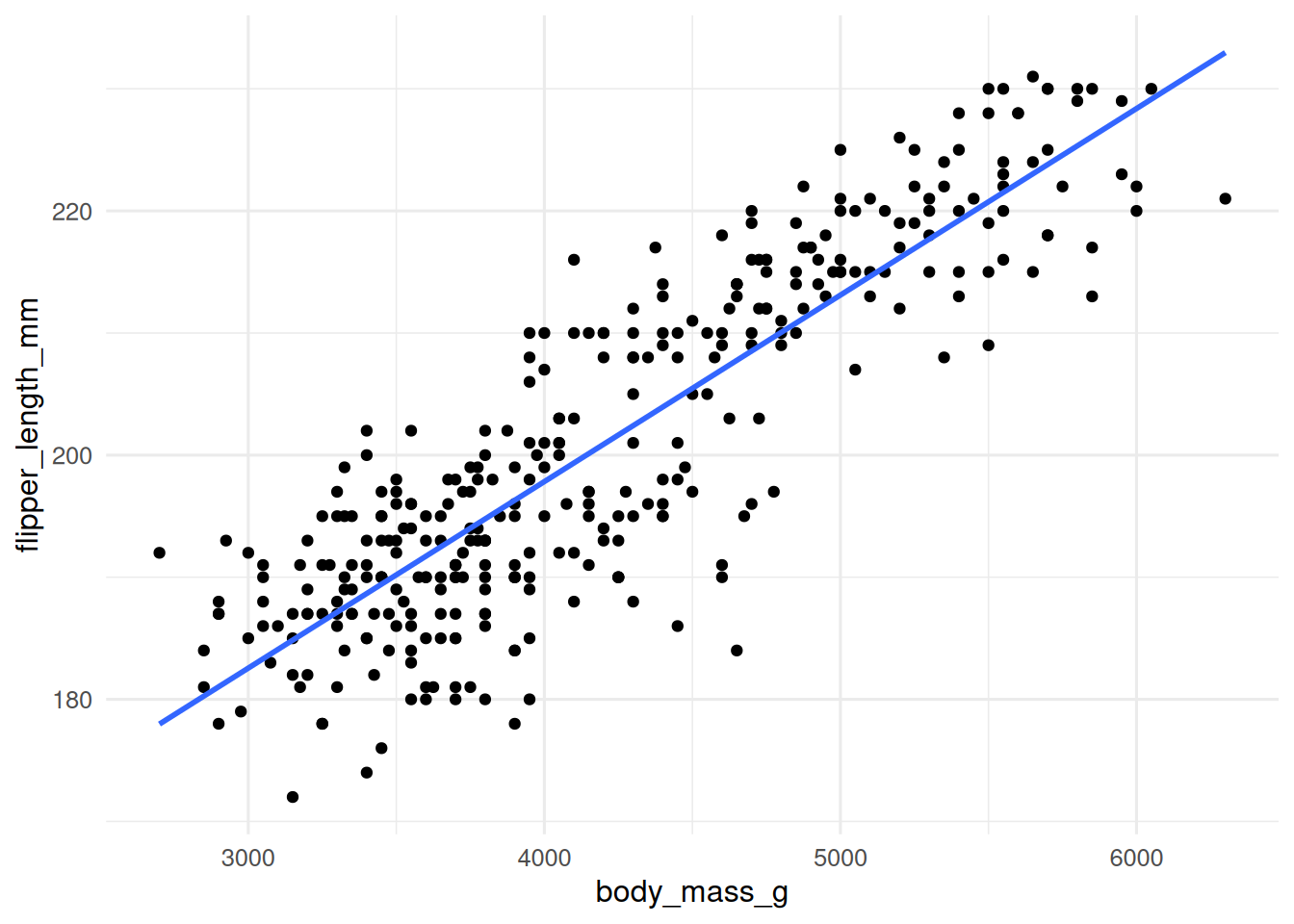
- 1.3
- 0.4
- 0.75
- 1
- 0
Question 20
Why should we not use regular/unadjusted \(R^2\) to select which variables to include in a model?
- It is too hard to calculate
- It is too dependent on units
- It always selects models that are too simple
- It always goes up whenever you add any variables to your model
- It can only be computed in simple linear regression
Question 21
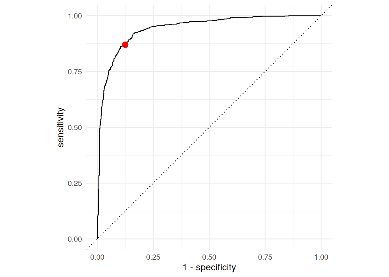
An ROC curve is plotted below. The red point corresponds to the values at some threshold. At this threshold, what were the true positive, false positive, true negative, and false negative rate?
Good Practice
Pick a concept we introduced in class so far that you’ve been struggling with and explain it in your own words.