Lab 3
Everything So Far
Introduction
In this lab, you’ll review topics you’ve worked with in previous labs and practice new topics we have learned since the last lab.
Code Guidelines
As we’ve discussed in the lecture, your plots should include an informative title, axes and legends should have human-readable labels and aesthetic choices should be carefully considered.
Titles that run off the page are NOT human readable. Long titles can be split into mutliple lines by adding “” into the string.
Additionally, code should follow the tidyverse style. Particularly,
there should be spaces before and line breaks after each + when building a ggplot,
there should also be spaces before and line breaks after each |> in a data transformation pipeline,
code should be properly indented,
there should be spaces around = signs and spaces after commas
use
|>instead of%>%when saving a data frame, use
<-instead of=
Furthermore, all code should be visible in the PDF output, i.e., should not run off the page on the PDF. Long lines that run off the page should be split across multiple lines with line breaks.1
As you complete the lab and other assignments in this course, remember to develop a sound workflow for reproducible data analysis. This assignment will periodically remind you to render, commit, and push your changes to GitHub.
Getting started
Log in to RStudio, clone your lab-3 repo from GitHub, open your lab-3.qmd document, and get started!
Step 1: Log in to RStudio
- Go to https://cmgr.oit.duke.edu/containers and log in with your Duke NetID and Password.
- Click
STA198-199under My reservations to log into your container. You should now see the RStudio environment.
Step 2: Clone the repo & start a new RStudio project
Go to the course organization at github.com/sta199-su25 organization on GitHub. Click on the repo with the prefix lab-3. It contains the starter documents you need to complete the lab.
Click on the green CODE button and select Use SSH. This might already be selected by default; if it is, you’ll see the text Clone with SSH. Click on the clipboard icon to copy the repo URL.
In RStudio, go to File ➛ New Project ➛Version Control ➛ Git.
Copy and paste the URL of your assignment repo into the dialog box Repository URL. Again, please make sure to have SSH highlighted under Clone when you copy the address.
Click Create Project, and the files from your GitHub repo will be displayed in the Files pane in RStudio.
Click lab-3.qmd to open the template Quarto file. This is where you will write up your code and narrative for the lab.
Step 3: Update the YAML
In lab-3.qmd, update the author field to your name, render your document and examine the changes. Then, in the Git pane, click on Diff to view your changes, add a commit message (e.g., “Added author name”), and click Commit. Then, push the changes to your GitHub repository, and in your browser confirm that these changes have indeed propagated to your repository.
If you run into any issues with the first steps outlined above, flag someone for help before proceeding.
Packages
In this lab, we will work with the
- tidyverse package for doing data analysis in a “tidy” way,
- readxl package for reading in Excel files,
- janitor package for cleaning up variable names, and
- palmerpenguins and datasauRus packages for some datasets
Part 1: datasauRus
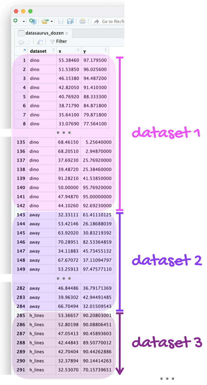
The data frame you will be working with in this part is called datasaurus_dozen and it’s in the datasauRus package. This single data frame contains 13 datasets, designed to show us why data visualization is important and how summary statistics alone can be misleading. The different datasets are marked by the dataset variable, as shown in Figure 1.
If it’s confusing that the data frame is called datasaurus_dozen when it contains 13 datasets, you’re not alone! Have you heard of a baker’s dozen?
Here is a peek at the dataset:
datasaurus_dozen # A tibble: 1,846 × 3
dataset x y
<chr> <dbl> <dbl>
1 dino 55.4 97.2
2 dino 51.5 96.0
3 dino 46.2 94.5
4 dino 42.8 91.4
5 dino 40.8 88.3
6 dino 38.7 84.9
7 dino 35.6 79.9
8 dino 33.1 77.6
9 dino 29.0 74.5
10 dino 26.2 71.4
# ℹ 1,836 more rowsQuestion 1
- In a single pipeline, calculate the mean of
x, mean ofy, standard deviation ofx, standard deviation ofy, and the correlation betweenxandyfor each level of thedatasetvariable. Make sure the results are visible for all datasets. Then, in 1-2 sentences, comment on how these summary statistics compare across groups (datasets).
For a reminder of what standard deviation is, refer to May 19th’s textbook reading: IMS chapter 5. This concept is fair game for the midterm. Math details are not needed, but you should understand the big picture idea.
Correlation is a new term. We will learn more details about this after the midterm, but the idea is that it measures the strength and direction of a linear relationship. Values range from -1 (perfect negative linear relationship) to 1 (perfect positive linear relationship). Values near 0 have little/no linear trend. This concept will not be tested on the midterm.
The datasauRus data is stored in a tibble: this is a special class of data frame used in the tidyverse. All tibbles are dataframes (with some extra features!), but not vice versa. By default, tibbles only print out 10 rows (whereas other dataframes print out all rows).
The result of the summarize should have 13 rows. To display all rows, add print(n = 13) as the last step of your pipeline.
- Create a scatterplot of
yversusxand color and facet it bydataset. Then, in 1-2 sentences, briefly discuss how these plots compare across groups (datasets). How does your response in this question compare to your response to the previous question and what does this say about using visualizations and summary statistics when getting to know a dataset?
When you both color and facet by the same variable, you’ll end up with a redundant legend. Turn off the legend by adding show.legend = FALSE to the geom creating the legend.
Part 2: mtcars
In this part, you’ll work with one of the most basic and overused datasets in R: mtcars. The data in this dataset come from the 1974 Motor Trend US magazine (so, yes, they’re old!) and provide information on fuel efficiency and other car characteristics.
Question 2
Since this data set is used in many code examples, it’s not unexpected that some analyses of the data are good and some not so much.
For both parts of this question, you should review the data dictionary that is in the documentation for the dataset which you can find at https://stat.ethz.ch/R-manual/R-devel/library/datasets/html/mtcars.html or by typing ?mtcars in your Console.
a. You come across the following visualization of these data.
ggplot(mtcars, aes(x = wt, y = mpg, color = am)) +
  geom_point() +
  labs(
    x = "Weight (1000 lbs)",
    y = "Miles / gallon"
  )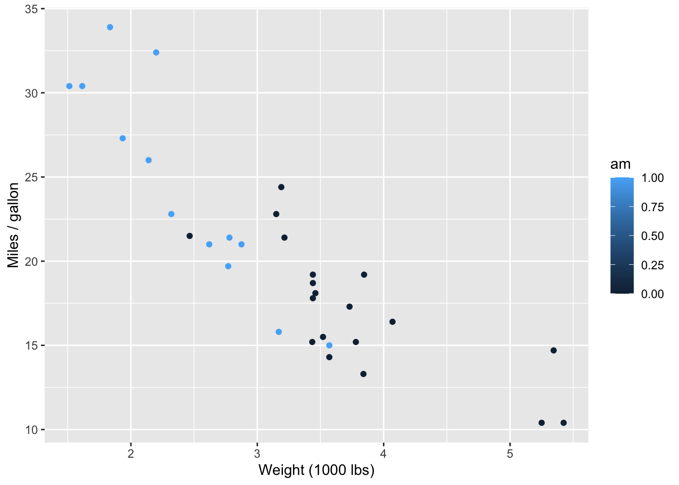
First, determine what is wrong with this visualization and describe it in one sentence. Then, fix it andimprove the visualization. As part of your improvement, make sure your legend
- is on top of the plot,
- is informative, and
- lists levels in the order they appear in the plot (that is, the level with more points on the left should be on the left of the legend)
b.Update your plot from part (a) further, this time using different shaped points for cars with V-shaped and straight engines. The legend should be again be informative, but this time, on the right of the plot.
Question 3
Your task is to make your plot from Question 2b as ugly and as ineffective as possible. Like, seriously. I want something that is apocalyptically heinous. Change colors, axes, fonts, themes, or anything else you can think of. You can search online for other themes, fonts, etc. that you want to tweak. The sky is truly the limit. I want Voldemort, Cruella de Vil, and Regina George all nodding in approval at how horrendously evil your plot is.
You must make at least 5 updates to the plot, and your answer must include:
a list of the at least 5 updates you’ve made to your plot from Question 2b, and
1-2 sentence explanation of why the plot you created is ugly (to you, at least) and ineffective.
The tidyverse documentation on themes may give you ideas about how you can alter the various features of the plot.
Part 3: Olympians
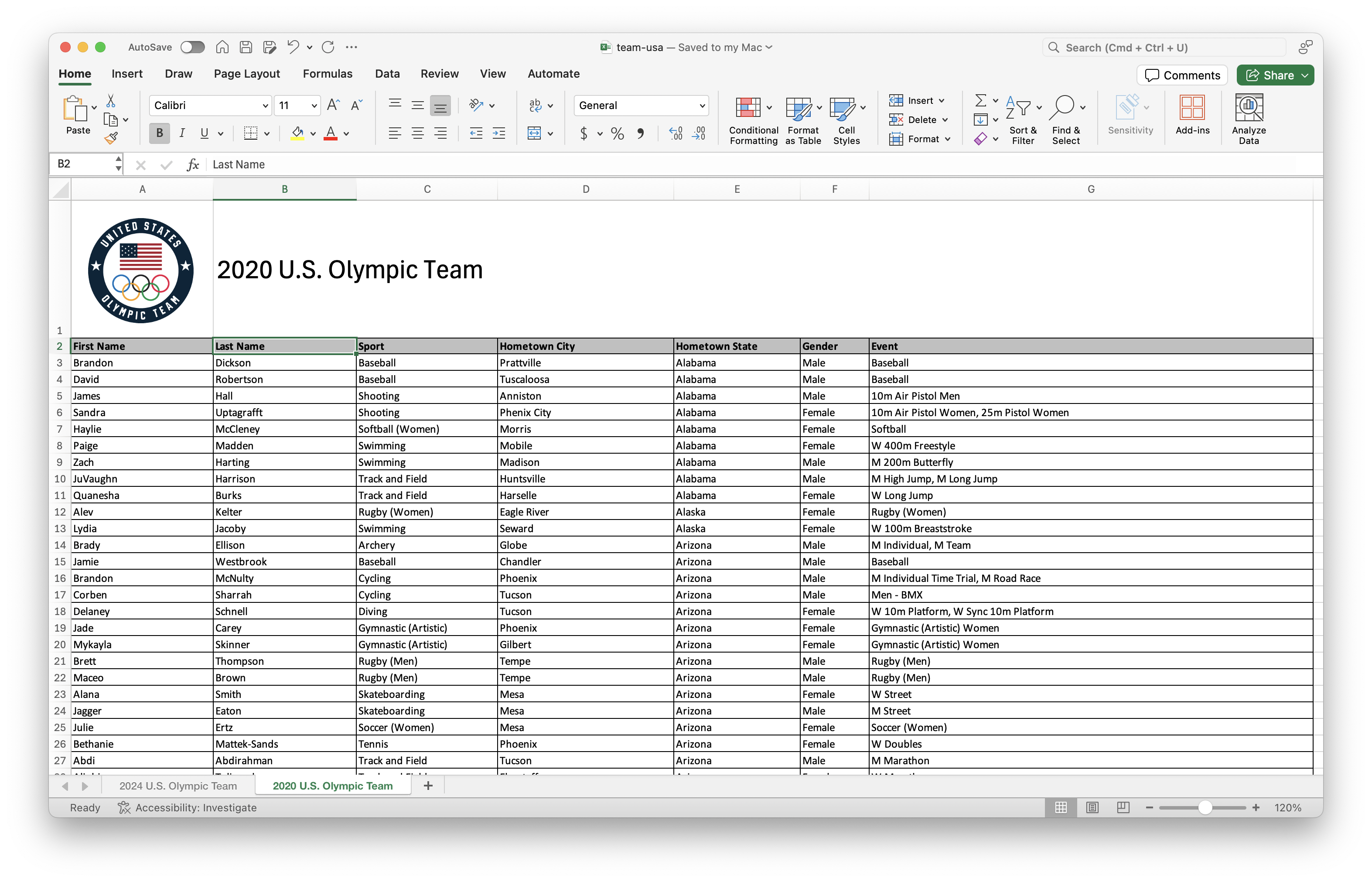
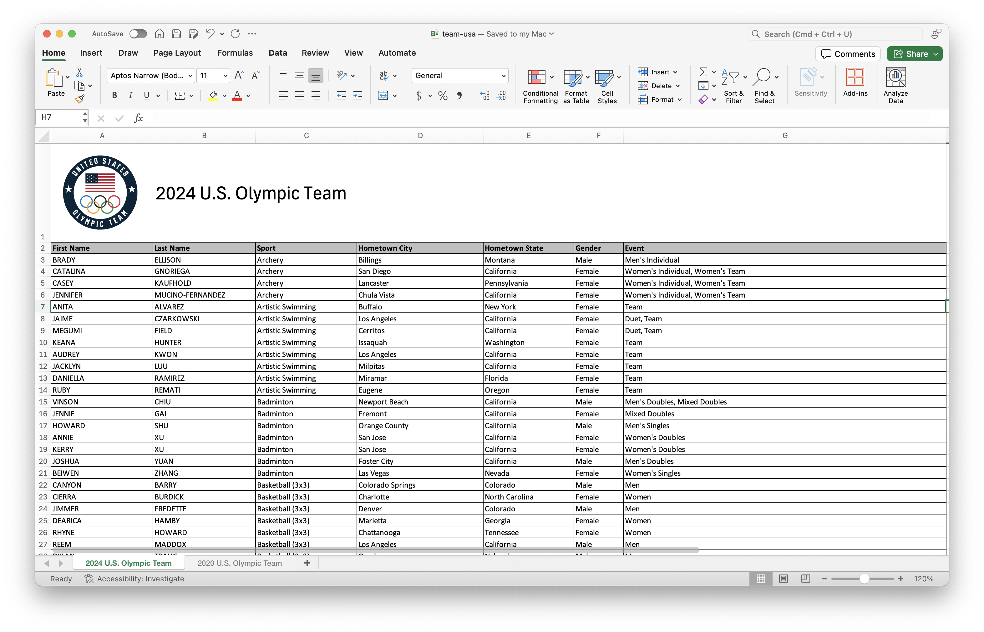
For this part, you’ll work with data from the rosters of Team USA from the 2020 and 2024 Olympics. The data come from https://www.teamusa.com and the rosters for the two games are in a single Excel file (team-usa.xlsx in your data folder), accross two separate spreadsheets within that file. Figure 2 shows screenshots of these spreadsheets.
Your goal is to answer questions about athletes who competed in both games and only one of the games.
Question 4
Read in and save the data from the Excel document as two separate data frames: team_usa_2020 and team_usa_2024. Then, display the first 5 rows of each.
Note that the data is stored in two sheets in the same Excel document. The read_excel function has a sheet argument that allows you to specify which sheet you want to read from.
Question 5
-
Now, we want to clean up the column names of the data (for instance, remove spaces to make them easier to deal with). Check out the documentation for the
clean_names()function from the janitor package at https://sfirke.github.io/janitor/reference/clean_names.html.
Use this function (with default settingts) to “clean” the variable names ofteam_usa_2020andteam_usa_2024, saving the data frames with the new variable names into the original data frame names. -
In each data set, save a new variable that:
paste()s together the first_name and last_name variables with a space in between andis the first column of the data frame (hint: check out
relocate()).
Question 6
- Using an appropriate `*_join()` function, determine how many athletes participated in both Olympic Games. Make sure to show the result of the join in a way that makes the resulting number clear (for instance, the number of rows in the joined data frame) AND state the result in a sentence.
Your answer to this question, based on the data frames you created, should be 0, even if it doesn’t make sense in context of actual Olympic athletes. We will investigate this in further parts.
-
If you have even a passing knowledge of the Olympic Games, you might know that there are some athletes that participated in both the 2020 and 2024 games, e.g., Simone Biles, Katie Ledecky, etc.
The reason why athlete names didn’t match across the two data frames is that in one data frame, names are in UPPER CASE, and in the other, they’re in Title Case. Update the 2020 data frame to make `name` all upper case. Display the first 10 rows of `team_usa_2020` with upper case names.
Your answer must use the str_to_upper() function.
Let’s try that question again: How many athletes participated in both Olympic Games?
How many athletes participated in the 2020 Olympic Games but not the 2024 Olympic Games? How many athletes participated in the 2024 Olympic Games but not the 2020 Olympic Games? Use appropriate joins to arrive at these answers. Make sure to show the result of the join in a way that makes the resulting numbers clear AND state them in a sentence.
Question 7
Now, let’s focus on the 2024 Olympic data in your team_usa_2024 data frame.
-
States of interest: Choose 2-5 states of interest and save them in a vector called
states_of_interest. For example, if I chose California, Louisiana, and North Carolina, this would be:states_of_interest <- c("Alabama", "Louisiana", "North Carolina")Then, filter the
team_usa_2024result to only include Olympians from these states, saving the results asteam_usa_2024_soi. In a single pipeline, use
team_usa_2024_soito determine how many Olympians from these states went to the 2024 Olympics, saving the results in data framestate_counts. Then, in a separate pipeline, display the results in increasing order of number of Olympians.Below are two different approaches to creating a bar chart representing the same information as in part (b).
The first usesgeom_bar(), as we have seen before. The second uses an alternative function for creating bar charts:geom_col().
Run both blocks of code. Discuss what is different between the two pieces of code and the difference between whatgeom_barandgeom_colneed to produce the same plot.
- Create a visualization that compares the proportions of male/female Olympians across your states of interest. In 1-2 sentences, briefly discuss the results. Do any of them surprise you?