AE 17:Hypothesis Testing
In this application exercise, we will do hypothesis testing for the slope in the linear model.
Packages
We will use tidyverse and tidymodels for data exploration and modeling, respectively, and the openintro package for the data, and the knitr package for formatting tables.
Data
In this exercise we will be studying predictors of mean household income accross counties in the United States. The contains results for 3142 counties’ results from the 2019 American Community Survey (this is all counties at the time). The data set county_2019 is from the openintro package. Go ahead and take a look at the data using glimpse; you can get more information with ?county_2019!
# add code hereNow, let’s imagine we only had a very small subset of these data to work with. That is, we only have data from a small subset of counties instead of from all counties. While that is not the case in this data set, we could easily images cases/studies where this might be true.
In the code below, we set a seed then take a random sample of 25 counties from our county_2019 data.
Question: With so little information, can we draw super strong conclusions?
Plot
Task: First, plot the relationship between mean household income mean_household_income and mean_work_travel for the full data set.
county_2019 |>
  ggplot(aes(x = uninsured, y = mean_household_income)) +
  geom_point() +
  geom_smooth(method = "lm")
`geom_smooth()` using formula = 'y ~ x'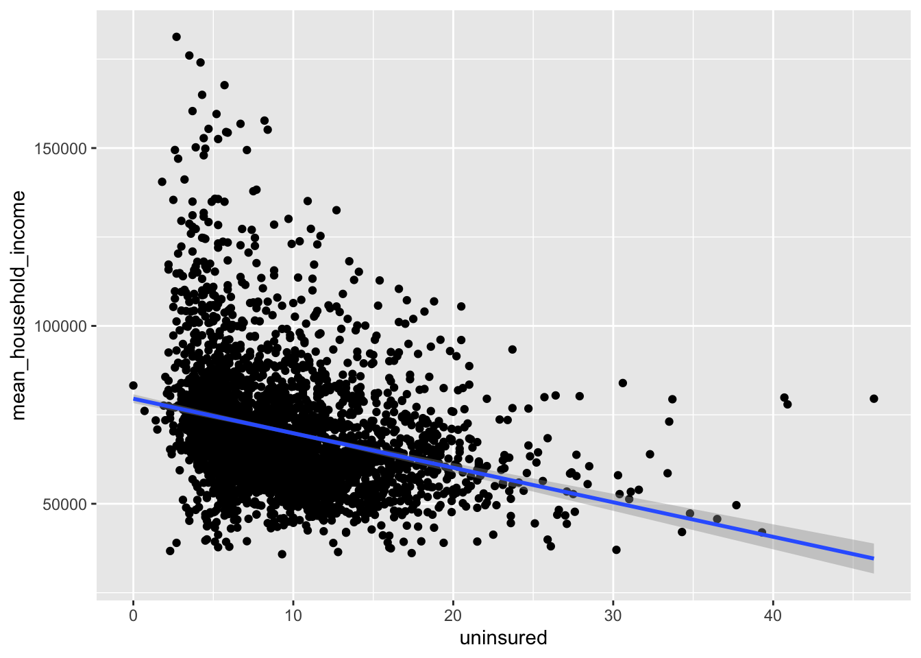
Task: Next, plot the relationship between mean household income mean_household_income and uninsured for the small sample data set.
counties_sample |>
  ggplot(aes(x = uninsured, y = mean_household_income)) +
  geom_point() +
  geom_smooth(method = "lm")
`geom_smooth()` using formula = 'y ~ x'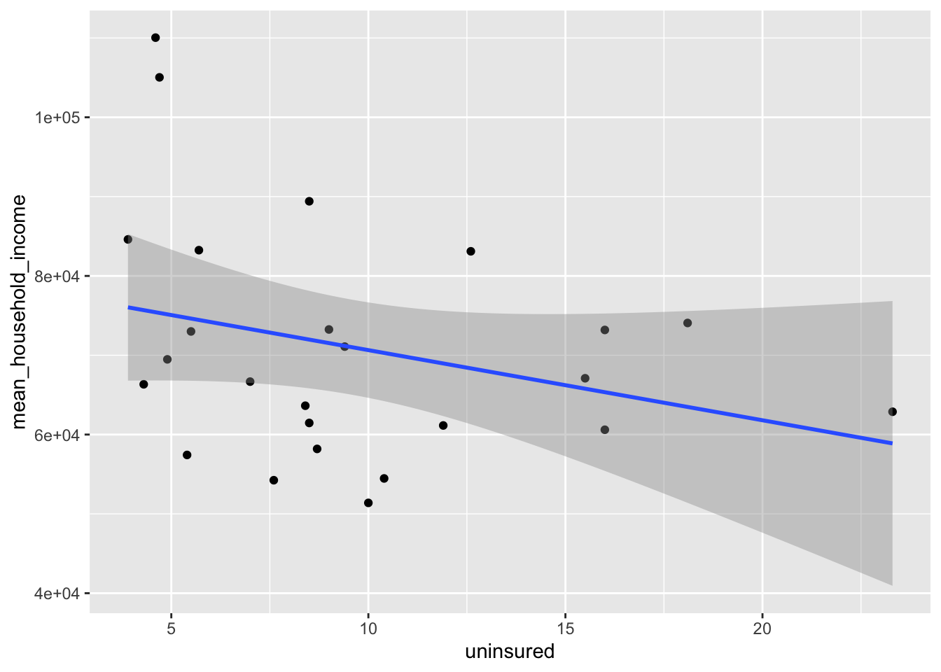
Inference with the small sample dataset
Point estimate
First, compute the point estimate using the small sample dataset.
observed_fit <- counties_sample |>
  specify(mean_household_income ~ uninsured) |>
  fit()

observed_fit
# A tibble: 2 × 2
term estimate
<chr> <dbl>
1 intercept 79489.
2 uninsured -884.Simulate the null distribution
Now, simulate the null distribution. We are testing \(H_0: \beta_1=0\) versus the alternative \(H_A: \beta_1\neq 0\).
set.seed(123)
null_dist <- counties_sample |>
  specify(mean_household_income ~ uninsured) |>
  hypothesize(null = "independence") |>
  generate(reps = 1000, type = "permute") |>
  fit()
Now, we are going to visualize the null distribution. Note that it’s centered at zero, because if the null were true and the true slope was in fact zero, we would expect noisy, imperfect estimates of the slope to wiggle around 0.
null_dist |>
  filter(term == "uninsured") |>
  ggplot(aes(x = estimate)) +
  geom_histogram()
`stat_bin()` using `bins = 30`. Pick better value with `binwidth`.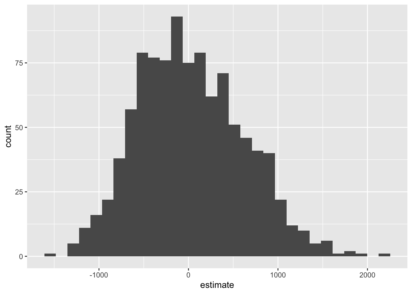
Where does our actual point estimate fall under the null distribution?
Shade the \(p\)-value:
visualize(null_dist) +
  shade_p_value(obs_stat = observed_fit, direction = "two-sided")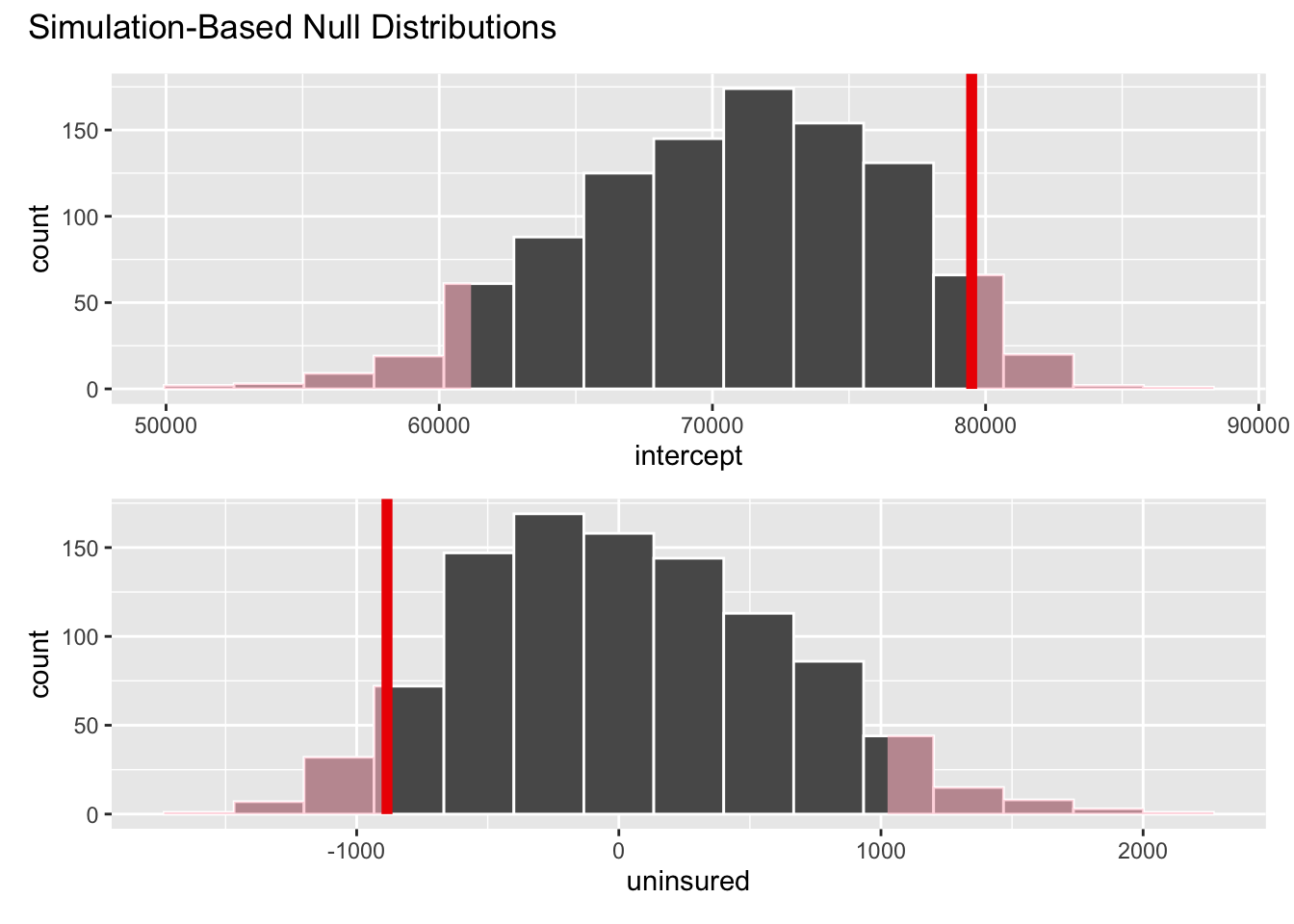
null_dist |>
  get_p_value(obs_stat = observed_fit, direction = "two-sided")
# A tibble: 2 × 2
term p_value
<chr> <dbl>
1 intercept 0.098
2 uninsured 0.098Interpretation: If the null were true (the true slope was zero), then there is approximately a 10% chance of observing data as or more extreme than the one we observed. At a 5% discernibility level, we fail to reject the null hypothesis. The data do not provide convincing evidence for the alternative hypothesis.