AE 02: Bechdel Data Vis
In this mini analysis we work with the data used in the FiveThirtyEight story titled “The Dollar-And-Cents Case Against Hollywood’s Exclusion of Women”.
This analysis is about the Bechdel test, a measure of the representation of women in fiction.
Getting started
Packages
We start with loading the packages we’ll use: tidyverse for majority of the analysis and scales for pretty plot labels later on.
Data
The data are stored as a CSV (comma separated values) file in the data folder of your repository. Let’s read it from there and save it as an object called bechdel.
bechdel <- read_csv("https://sta199-s24.github.io/data/bechdel.csv")Get to know the data
We can use the glimpse function to get an overview (or “glimpse”) of the data.
# add code here- What does each observation (row) in the data set represent?
Each observation represents a ___.
- How many observations (rows) are in the data set?
There are 1615 movies in the dataset.
- How many variables (columns) are in the data set?
There are ___ columns in the dataset.
Variables of interest
The variables we’ll focus on are the following:
-
budget_2013: Budget in 2013 inflation adjusted dollars. -
gross_2013: Gross (US and international combined) in 2013 inflation adjusted dollars. -
roi: Return on investment, calculated as the ratio of the gross to budget. -
clean_test: Bechdel test result:-
ok= passes test dubious-
men= women only talk about men -
notalk= women don’t talk to each other -
nowomen= fewer than two women
-
-
binary: Bechdel Test PASS vs FAIL binary
We will also use the year of release in data prep and title of movie to take a deeper look at some outliers.
There are a few other variables in the dataset, but we won’t be using them in this analysis.
Visualizing data with ggplot2
ggplot2 is the package and ggplot() is the function in this package that is used to create a plot.
-
ggplot()creates the initial base coordinate system, and we will add layers to that base. We first specify the data set we will use withdata = bechdel.
ggplot(data = bechdel)
- The
mappingargument is paired with an aesthetic (aes()), which tells us how the variables in our data set should be mapped to the visual properties of the graph.
As we previously mentioned, we often omit the names of the first two arguments in R functions. So you’ll often see this written as:

Note that the result is exactly the same.
- The
geom_xxfunction specifies the type of plot we want to use to represent the data. In the code below, we usegeom_pointwhich creates a plot where each observation is represented by a point.
ggplot(bechdel, aes(x = budget_2013, y = gross_2013)) +
  geom_point()
Warning: Removed 15 rows containing missing values or values outside the scale range
(`geom_point()`).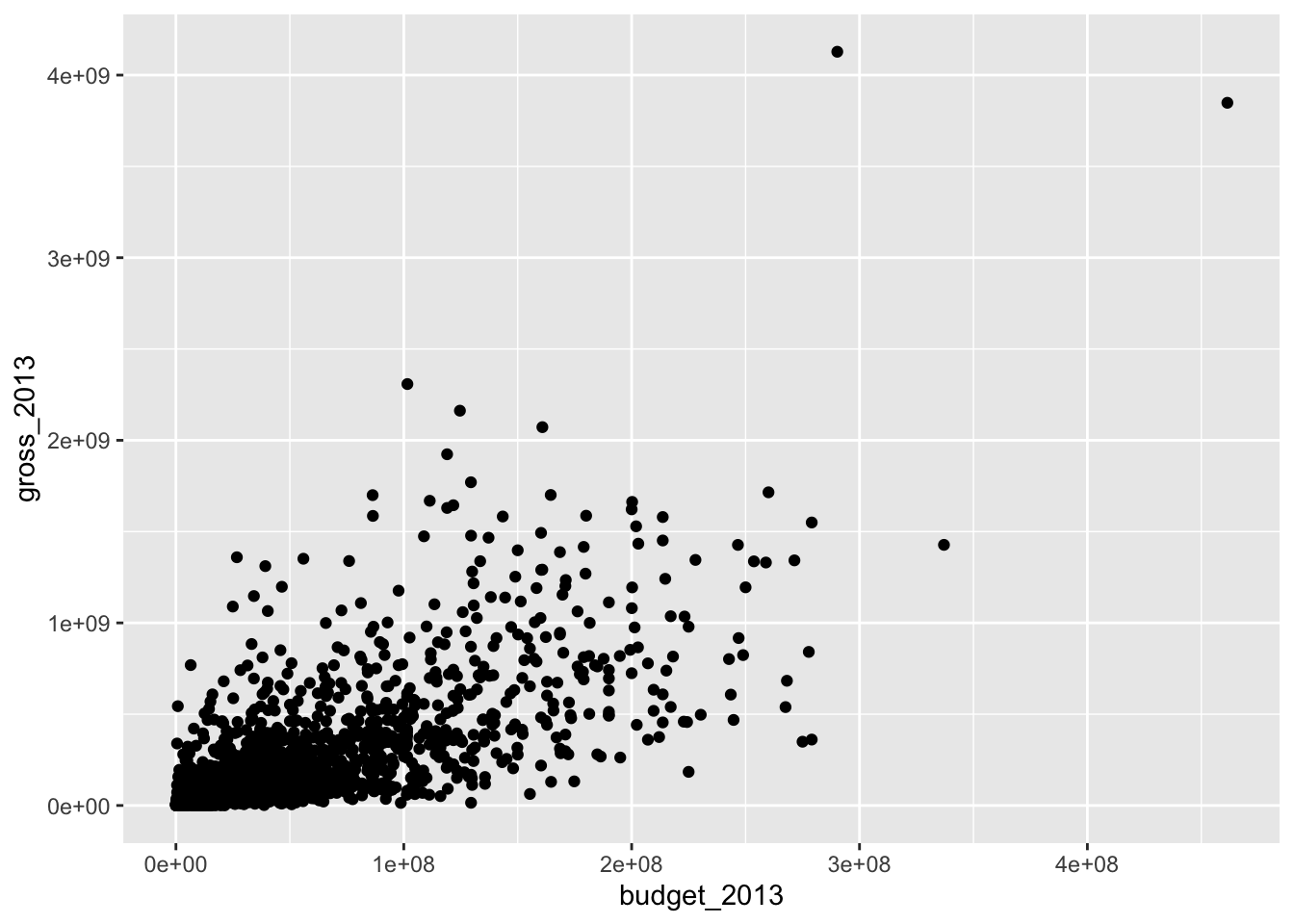
Note that this results in a warning as well. What does the warning mean?
Gross revenue vs. budget
Step 1 - Your turn
Modify the following plot to change the color of all points to a different color.
See http://www.stat.columbia.edu/~tzheng/files/Rcolor.pdf for many color options you can use by name in R or use the hex code for a color of your choice.
ggplot(bechdel, aes(x = budget_2013, y = gross_2013)) +
  geom_point(color = "deepskyblue3")
Warning: Removed 15 rows containing missing values or values outside the scale range
(`geom_point()`).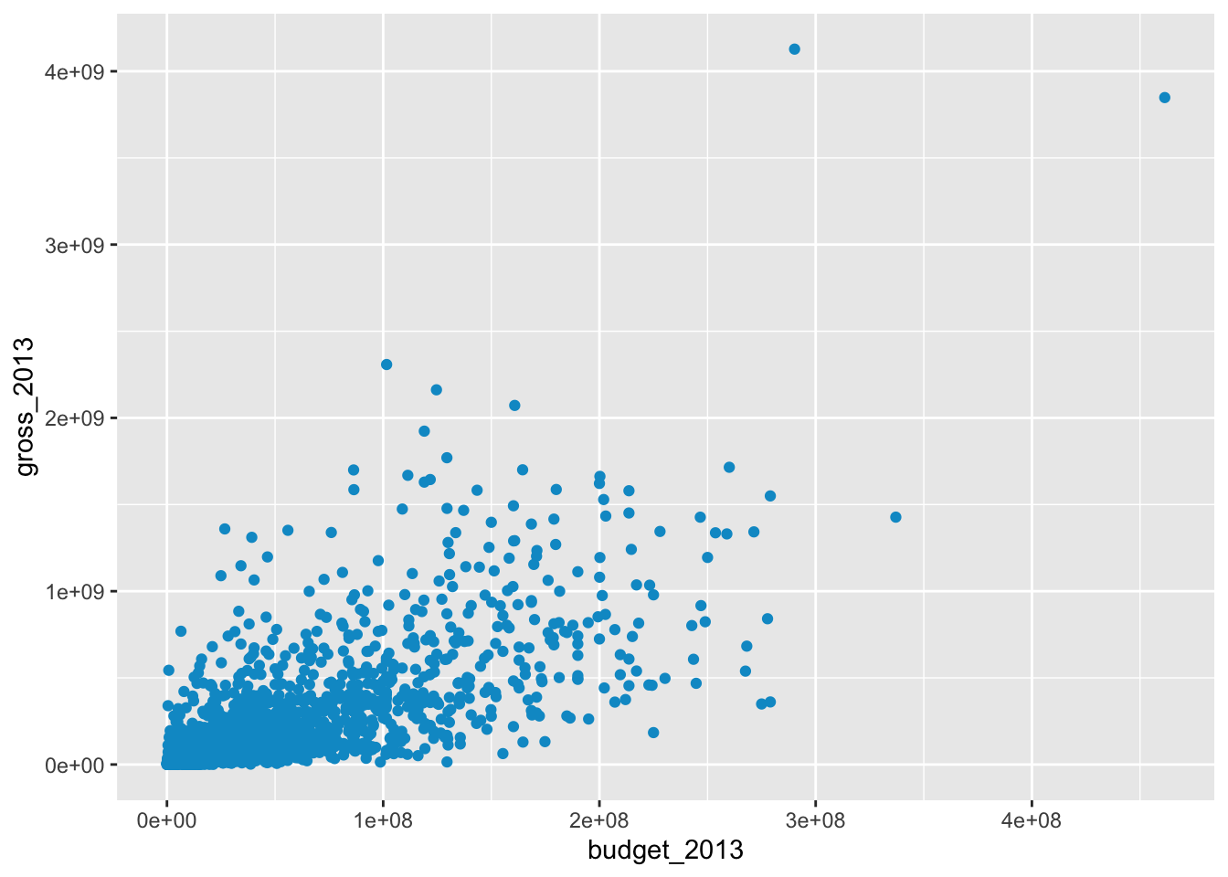
Step 2 - Your turn
Add labels for the title and x and y axes.
ggplot(bechdel, aes(x = budget_2013, y = gross_2013))+
  geom_point(color = "deepskyblue3") +
  labs(
    x = "___",
    y = "___",
    title = "___"
  )
Warning: Removed 15 rows containing missing values or values outside the scale range
(`geom_point()`).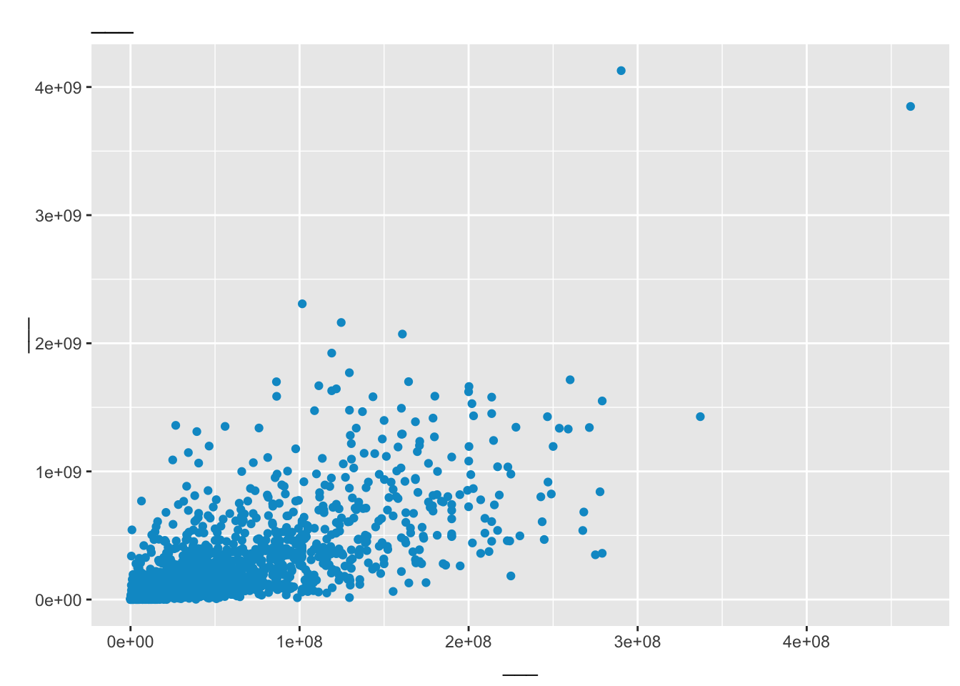
Step 3 - Your turn
An aesthetic is a visual property of one of the objects in your plot. Commonly used aesthetic options are:
- color
- fill
- shape
- size
- alpha (transparency)
Modify the plot below, so the color of the points is based on the variable binary.
ggplot(bechdel, aes(x = budget_2013, y = gross_2013)) +
  geom_point() +
  labs(
    x = "Budget (in 2013 $)",
    y = "Gross revenue (in 2013 $)",
    title = "Gross revenue vs. budget, by ___"
  )
Warning: Removed 15 rows containing missing values or values outside the scale range
(`geom_point()`).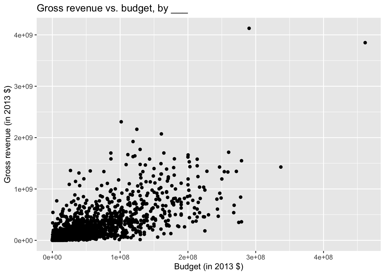
What is the difference between how you changed the color here and how you changed the color in Step 1??
Add answer here.
Step 4 - Your turn
Expand on your plot from the previous step to make the size of your points based on roi.
# add code hereStep 5 - Your turn
Expand on your plot from the previous step to make the transparency (alpha) of the points 0.5.
# add code hereStep 6 - Your turn
Expand on your plot from the previous step by using facet_wrap to display the association between budget and gross for different values of clean_test.
# add code hereStep 7 - Demo
Improve your plot from the previous step by making the x and y scales more legible.
Make use of the scales package, specifically the scale_x_continuous() and scale_y_continuous() functions.
# add code hereStep 8 - Your turn
Expand on your plot from the previous step by using facet_grid to display the association between budget and gross for different combinations of clean_test and binary. Comment on whether this was a useful update.
# add code hereAdd comment here…
Step 9 - Demo
What other improvements could we make to this plot?
# add code hereRender, commit, and push
If you made any changes since the last render, render again to get the final version of the AE.
Check the box next to each document in the Git tab (this is called “staging” the changes). Commit the changes you made using a simple and informative message.
Use the green arrow to push your changes to your repo on GitHub.
Check your repo on GitHub and see the updated files. Once your updated files are in your repo on GitHub, you’re good to go!
IF TIME: Back to the penguins
It’s your turn!
Load and look at the penguins data frame. What are two variables you could explore the relationship between?
# Hint: You will need to load the necessary package first!
Try to make a plot (or many!).
# add code hereSome ideas to try out if you’re feeling particularly ambitous:
How can you change the colors of a variable (in an aesthetic) to any you want ?
How can you make the font of a label bigger?
Can you facet by more than one variable?
Render, commit, and push
If you made any changes since the last render, render again to get the final version of the AE.
Check the box next to each document in the Git tab (this is called “staging” the changes). Commit the changes you made using a simple and informative message.
Use the green arrow to push your changes to your repo on GitHub.
Check your repo on GitHub and see the updated files. Once your updated files are in your repo on GitHub, you’re good to go!